
When Rustic met Modern
Share
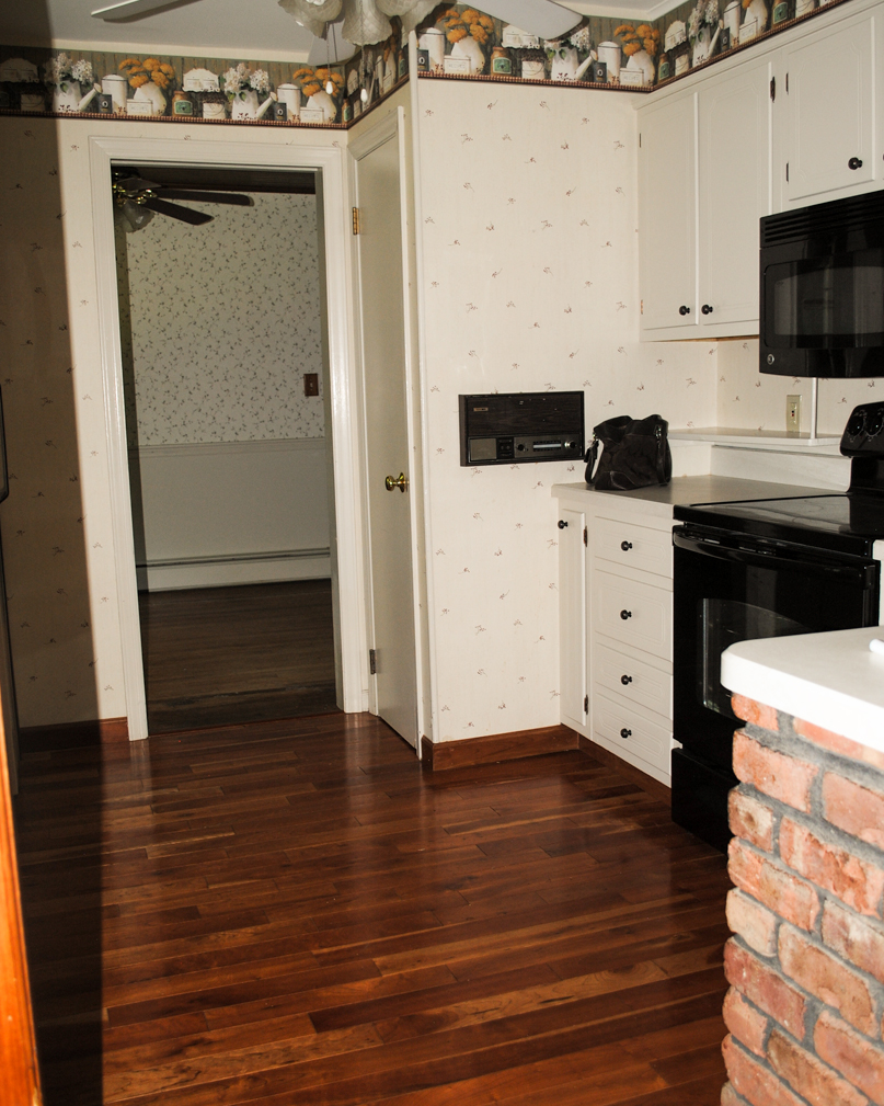
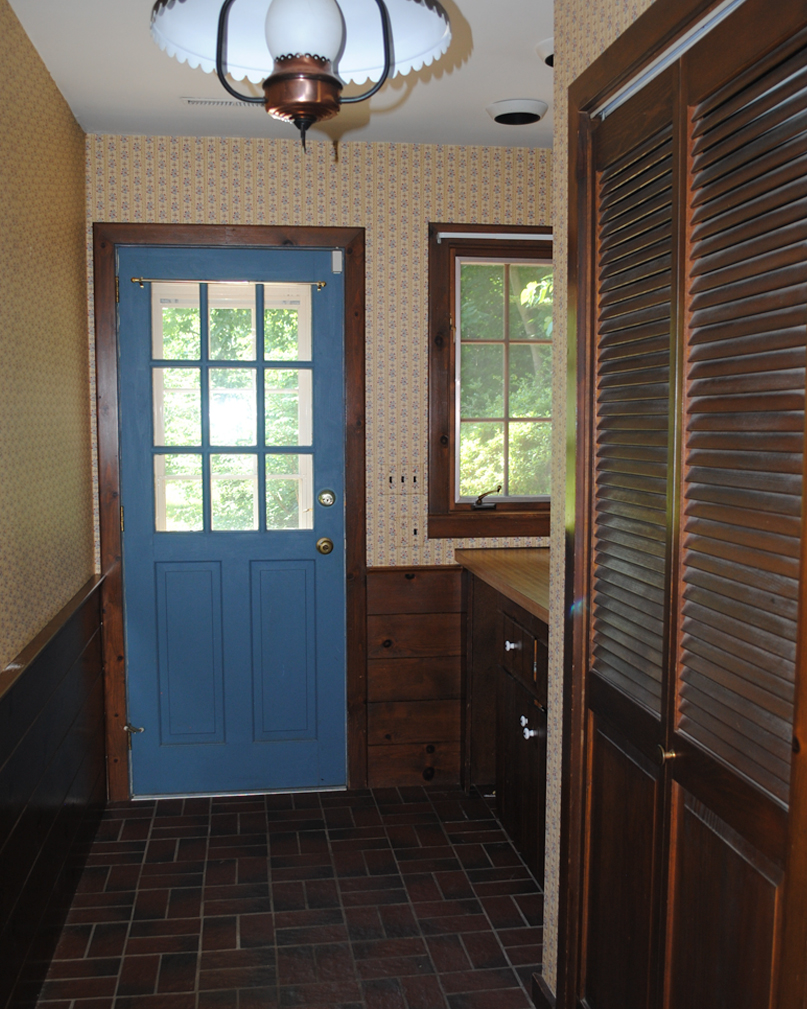
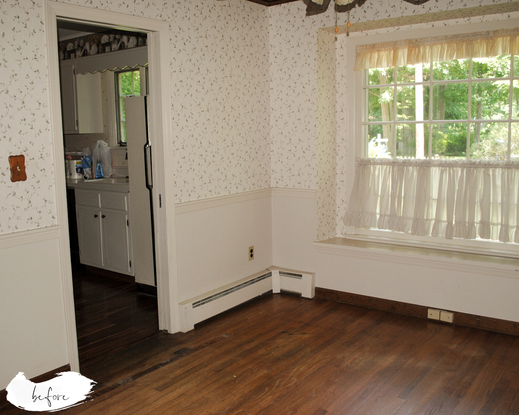
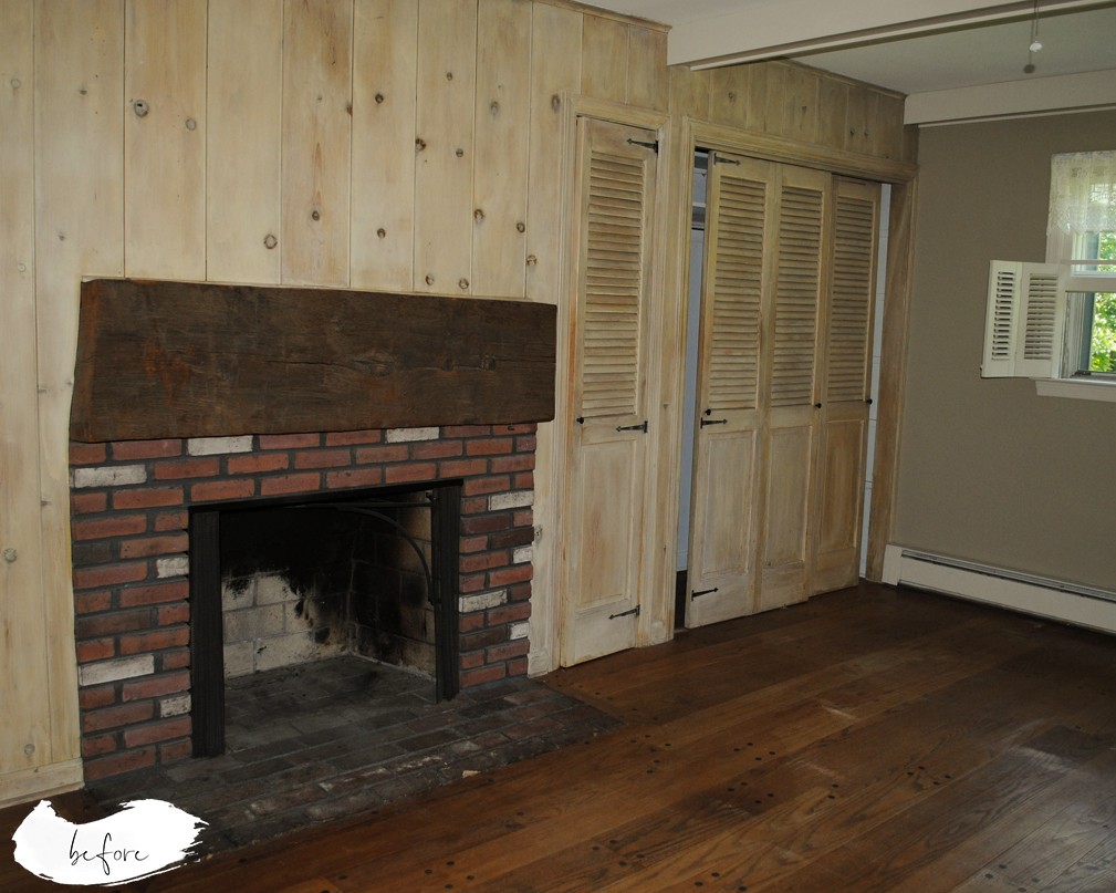
One of the things I have always been mindful of in my design aesthetic (besides high functionality!), is defining a vision, a tone, a mood for my spaces. A home needs to flow together, have a common thread, belong together. Since Old Beekman was a home that grew from its original federal cape style, to including a breezeway and garage in its first expansion, to then growing backward and upward with a second expansion, it had never had a cohesive design as a whole. In its purchased condition, it had three types of carpet, six different types of wood and laminate flooring, and twelve types of wallpaper.
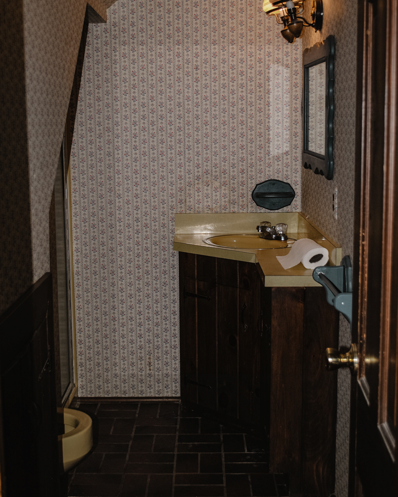
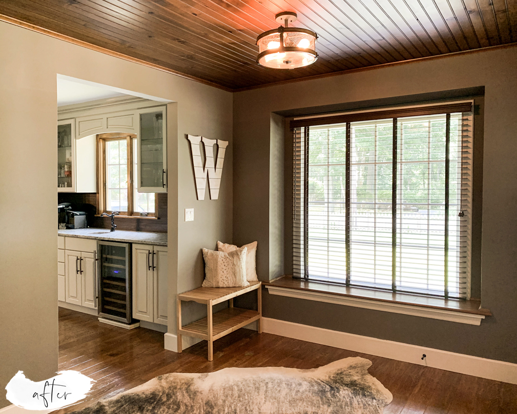
The most impactful decision we made to improve Old Beekman’s cohesiveness (while preserving her rusticity!), was choosing the predominant hardwood flooring of the home (which, thankfully, was the type that ran on both sets of stairwells), and replicating it in the other rooms that had different types of flooring. In rooms that had wide-plank hardwood (Main Bedroom, Dining Room, and Family Room), we opted for refinishing it, choosing an Early American stain to “match” the original stairwell color. In rooms that originally had skinny plank hardwood, laminate or carpet, (kids’ bedrooms, Formal Living Room, Foyer, Walk in Closet, Butler’s Pantry, Powder Room, Coat Closet, Office/Guest Bedroom) we installed new Acacia hardwood flooring, which naturally “matched” the original stairwell floors. Is it a perfect match? No. Does it have to be? No! Just by keeping the flooring similar throughout, Old Beekman immediately felt more intentional.

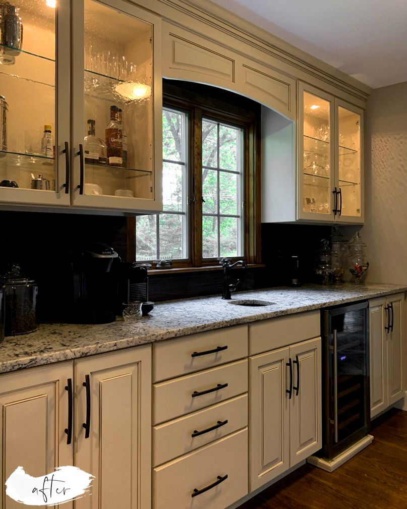
(Note: We did keep a different floor in the house. As you know from our kitchen transformation, our kitchen’s hand-scraped, top-nailed walnut flooring was part of why we fell in love with this home. So, we have chosen to not only preserve it, but to feature it!)
It takes more than similar flooring to pull a design vision together though. We felt passionate about protecting Old Beekman’s original rustic charm while meeting the needs of our modern lives. To marry these two essences throughout, we had to be intentional about the footprint, design flow, and how to mix these elements.
Because I am a self-proclaimed Design nerd, I made a diagram of the rustic modern flow in our home:

Instead of writing paragraphs attempting to describe everything, here is a list of our anchoring design choices for the “rustic” part of the home, and the “modern” part of the home:
Rustic
- New-yet-original-style stained windows in all rustic spaces;
- Dark wood plank blinds;
- Familial lighting choices (wood, metal and seeded glass) through these spaces;
- Wide plank trim and molding stained in original home stain (red-toned walnut);
Modern
- New, unified style white windows in all modern spaces;
- Soft, white, honeycomb blackout shades in all bedrooms;
- White wood plank blinds in bathrooms;
- Familial lighting choices (white linen drum shades) throughout bedrooms;
- Wide plank trim painted white;
- Doors painted white;
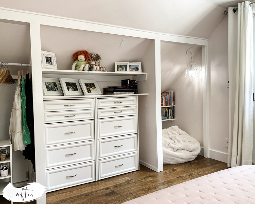
- All closets in white;
- Black matte metal hardware in all doors;
- Brushed and polished stainless steel hardware (curtain rods, pulls);
- Unifying floor tile choice for all “wet rooms” in the house (bathrooms, mudroom, laundry room);
Some spaces had a dominant aesthetic. Bedrooms and bathrooms, for example, are largely modern. Other spaces, such as the Foyer and the Butler’s Pantry, had major influences from both aesthetics. The Foyer ended up with white windows, white trim, but, since it has a skinny lap ceiling, original to the house, we worked with rustic design choices such as dark wood blinds. The Butler’s Pantry, adjacent to the Foyer, received stained, original-style windows, however, it received crisp white baseboards.

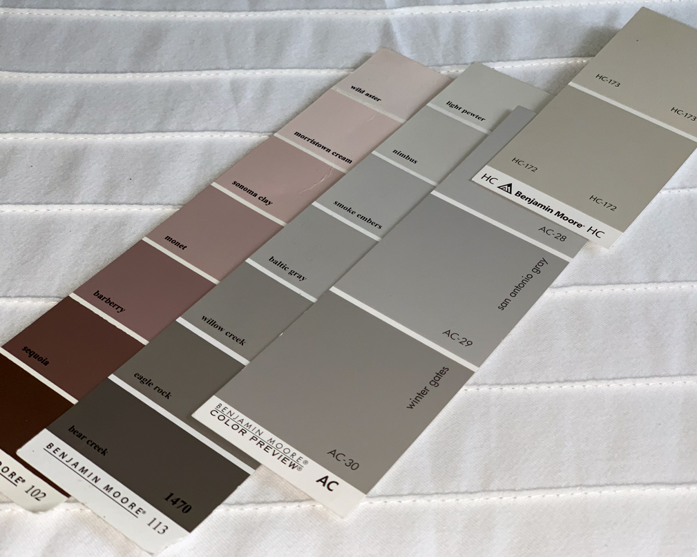
Finally, we committed to a color palette for our home. When assembling a design color palette, we always choose a “base” color, and work with complementing colors to bring interest to different rooms. The only way to read a color is to try it in your home. Natural lighting, electrical lighting, material choices of your home — all of it impacts how a color reads in your home. With Old Beekman, we quickly learned that any cool color (with a blue base) read cold and out of place. We settled then on a rich, putty-gray color (Benjamin Moore 1469 Eagle Rock) as the base of our palette. With our home’s light exposure, this color reads both as modern due to its gray tones, and rustic given the amount of brown and warmth in its pigmentation.
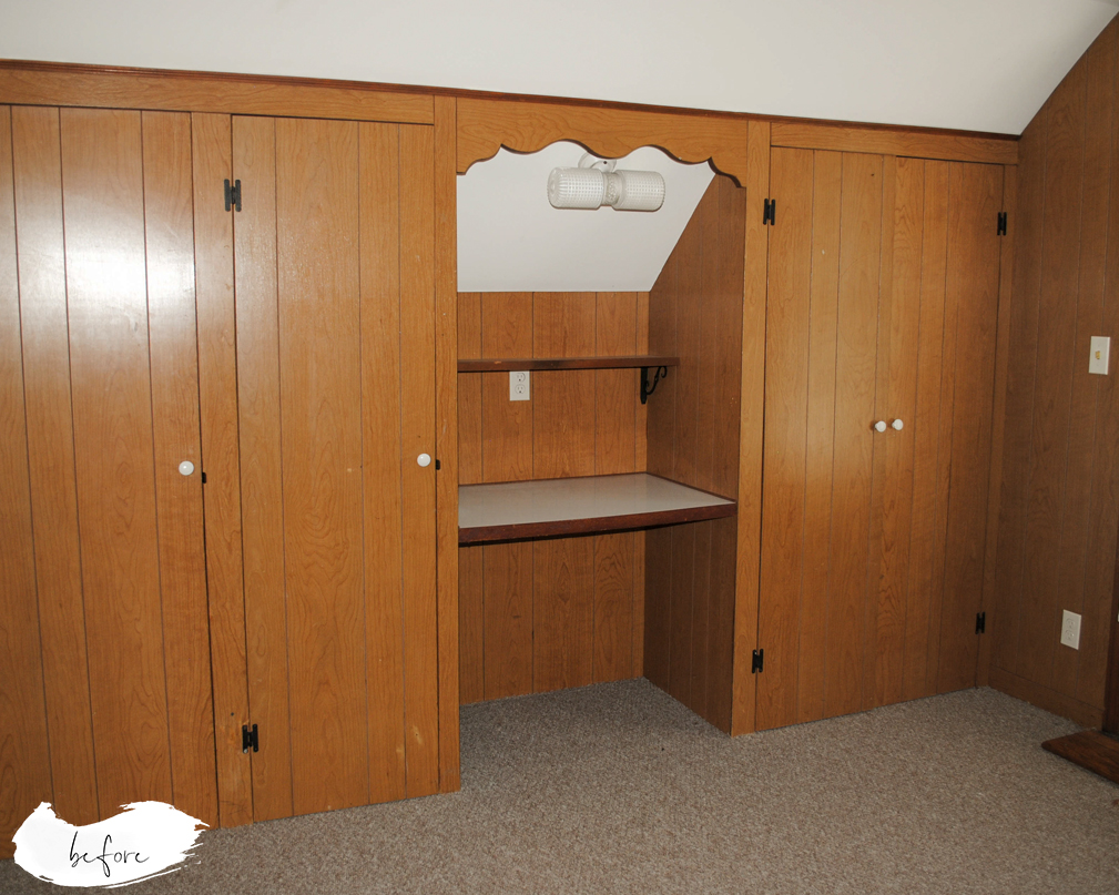
With our main design choices defined, 2016 and 2017 became years full of projects. As much as we (okay, I) wanted it all instantaneously done, we have always gone at the speed our budget allowed. And so, slowly but surely we moved forward, one project at a time. We removed ALL twelve types of wallpaper, we painted ceilings, walls, baseboards, we stained wood (and hired a great local painter to help us with some of these three jobs!). We added lighting to each room, we added interesting architectural elements, and designed each room. Some, are still work in progress, as we have not yet invested in new furniture. But… that’s a part of the living, breathing, changing reality of a home!